Headspace
A Calmer Path to Mindfulness
UX/UI, mobile, health, b2c
2025
Background
I chose Headspace as a case study because, despite its aim to support mindfulness and reduce stress, using the app was frustrating
The meditation and article lists were unclear, some content felt irrelevant, and the numerous options made it hard to know what would be most beneficial, revealing a need for better organization and personalization

Introduction
This redesign aimed to create a calmer, more organized experience that truly supports mindfulness
By reducing visual clutter, improving navigation, and introducing features that respond to a user’s emotional state, the goal was to make the app feel intuitive and relaxing from the first tap
I served as the Product Designer responsible for the end-to-end redesign
I restructured the app’s layout, introduced new features like mood tracking, and refined the interface to create a calmer, more organized experience. This work covered wireframing, prototyping, UI design, and UX writing, all guided by user feedback
The Problem
The app’s current design felt cluttered and overwhelming, which distracted from its core purpose of promoting mindfulness
Disorganized content, unclear navigation, and competing visual elements created friction, leaving users feeling more anxious than calm
Research
I took a look at user feedback and how the Headspace app organizes its content to find ways to improve it
This included checking out reviews and looking at some good examples of content organization
Current Design
I looked at user reviews to find problems with the app’s layout, navigation, and finding content
These reviews pointed out specific areas where users had difficulties, giving clear insight into the problems that the redesign needed to fix

Home Screen
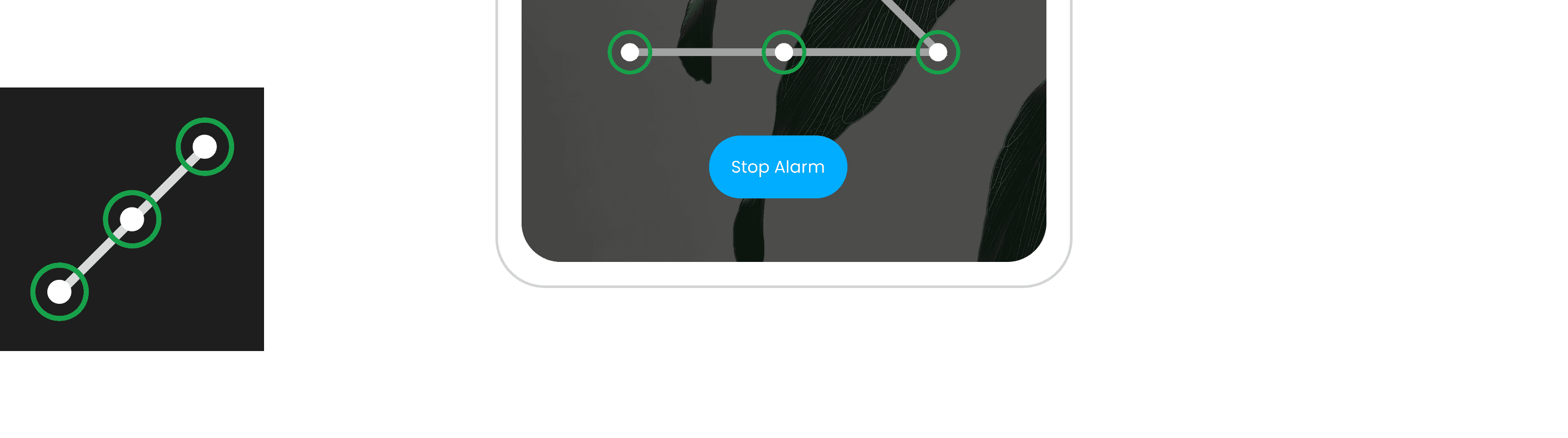
The home screen greets me with a list of meditations and articles each morning. However, I'm unclear about what to do next. Are these items a guide to follow? Do I need to complete all three? The lack of instructions left me confused

Further down the home screen
As I scroll down the home screen, I see a list of tasks for the afternoon and evening as well. This list indicates things I need to complete, but I wonder: do I need to do all three? Are these tasks relevant to what I want to achieve?

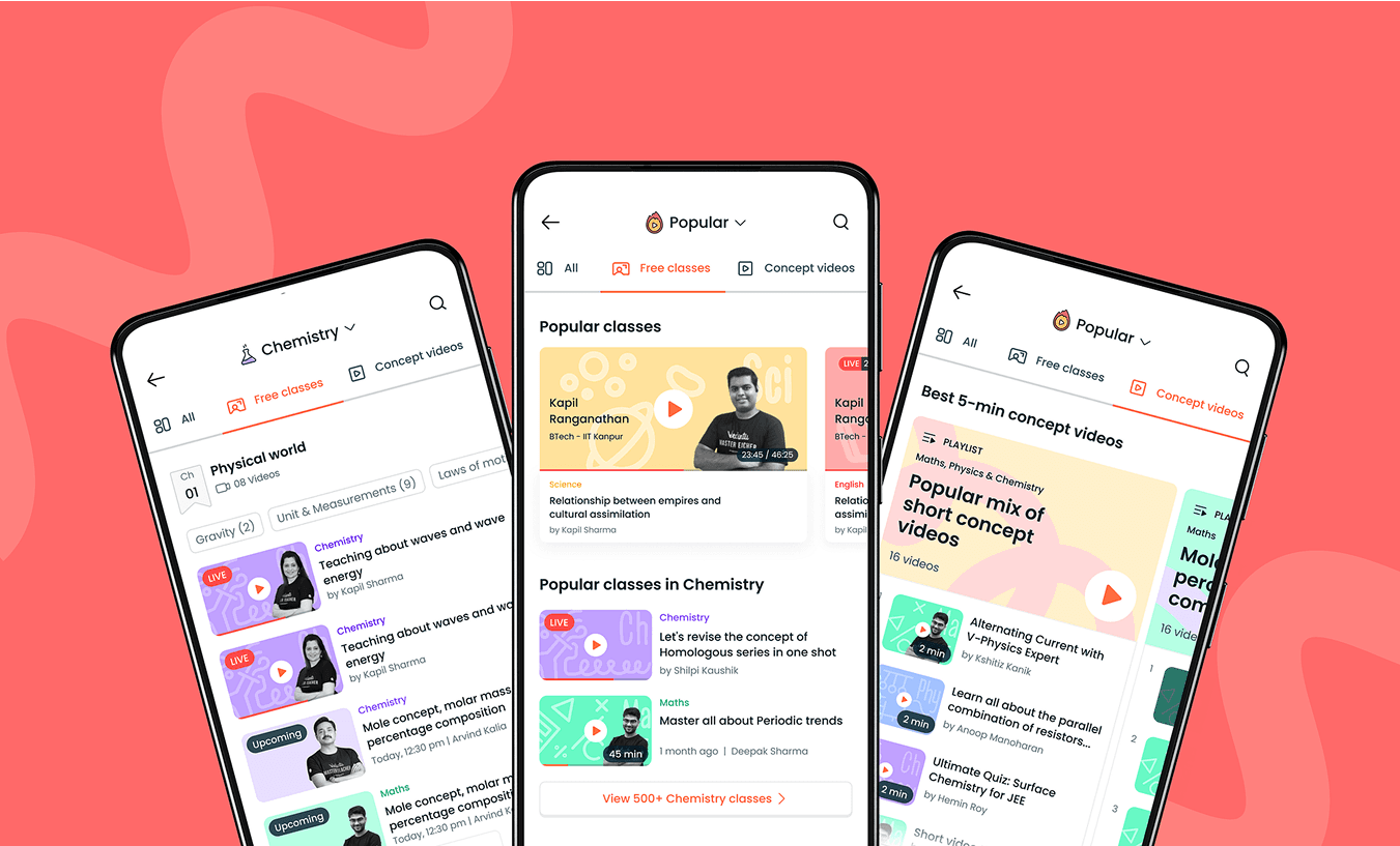
Explore Page
At the top, there are four main categories along with a search bar. Below that, you'll find a list of collections. However, clicking on a collection takes you to a lengthy list of all items related to that collection, which doesn't effectively narrow down the relevant material
Reviews
I looked at user reviews to find problems with the app’s layout, navigation, and finding content
These reviews pointed out specific areas where users had difficulties, giving clear insight into the problems that the redesign needed to fix
Cluttered Layout
The screens were filled with too much information, making them feel impersonal and not very helpful
COnfusing Navigation
Locating features can be difficult because the menu design and labels are confusing
Hard to find Content
The content is organized solely into main categories, which makes it difficult to find specific items since there are no subcategories or personalized recommendations
Exploring Organizational Tools
Websites and apps that offer a lot of products or information usually have a system to help users find what they need more easily
I looked to popular sites like Amazon, Apple, and Dribbble for design ideas because they do a great job with user-friendly organization
Amazon
Amazon provided tabs at the to for major categories. To the left they added a filter sidebar to help narrow down the selections
Apple
Apple's method was essentially the same, showing off a categorized tab bar at the top with filters off to the left.
Dribbble
Dribbble provided a lot of inspiration but the design below was the most aligned to the kind of organization i was looking for.
Similar to Amazon and Apple, this design features a tab bar, search, and dropdown
Success Criteria
The redesign needed clear goals to guide decisions and measure outcomes
These criteria ensured the changes have purpose and addressed real user needs
1
Simpler Navigation
Users can move between meditation, sleep, and focus tools in one to two taps without backtracking or searching through menus
2
Organized Content
Users see meditations, sleep tools, and other features arranged in well-labeled categories that can be scanned at a glance
3
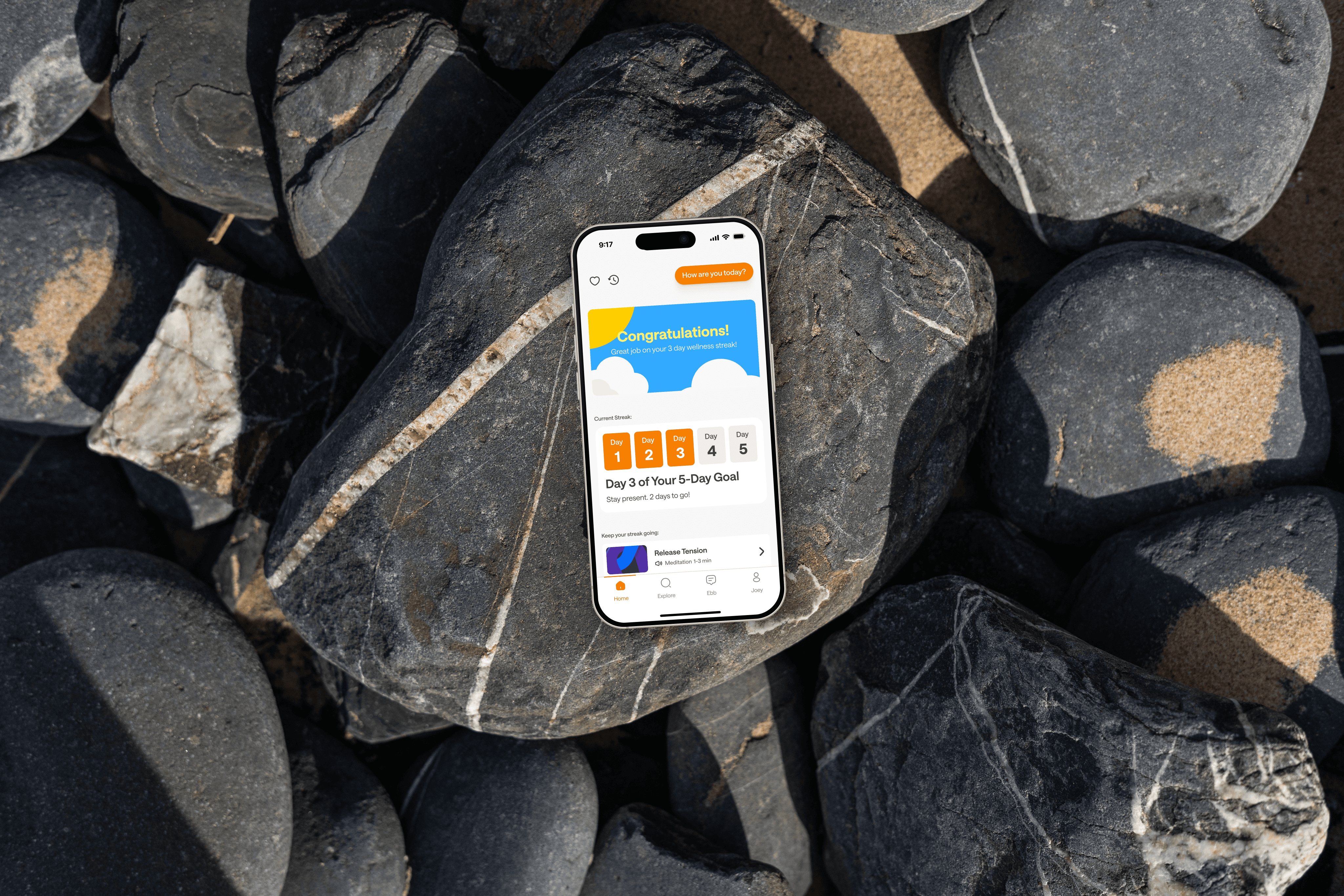
Mood Tracking Integration
Users can quickly record their mood, with suggestions that match their emotional state
4
Increase Motivation
Features such as streak tracking encourage users to return and build a consistent mindfulness habit
Research
Research shows users felt the same frustrations I felt
Navigation was cluttered, features were difficult to find, and the flow caused unnecessary friction. These reviews came from Apple's App Store, confirming that others shared similar frustrations
Research
Research shows users felt the same frustrations I felt
Navigation was cluttered, features were difficult to find, and the flow caused unnecessary friction. These reviews came from Apple's App Store, confirming that others shared similar frustrations
User Interviews
I uncovered a few pain points that helped me shape the final designs
I took the time to carefully plan the questions I wanted to ask during these interviews. The interviewees were people with different lifestyles and had different needs
Here are some of the questions i asked
Do you regularly stay on top of your health and get checkups from a doctor?
How are you currently getting medical care?
What challenges are currently preventing you from getting the medical attention you need?
What features or tools would make it easier for you to manage your healthcare needs through an app?
In an ideal app, how would you prefer to receive medical care or schedule appointments?
Affinity Map
Affinity mapping helped uncover key themes and valuable insights from user interviews
By organizing their feedback into themes, I got a better understanding of what users really need and why they're not getting the care they need

User Insights
The information gathered from the interviews and the affinity maps showed some pretty surprising insights
Busy users needed convenient access to healthcare from any location
People with anxiety preferred receiving care from the comfort of their own homes
People with mobility needs were frustrated by limited access options
Appointment wait time can range anywhere between two weeks to a few months
Users needing quick advice need faster ways to get medical help
COMPETITIVE ANALYSIS
There are existing, successful applications that already offer the ability to get medical attention virtually
Here is what they offered and what needed improvement:


D
Doctor on Demand
Doctor on Demand was the most successful offering availability 365/24/7 but showed very basic UI and users complained of lack of communication in between sessions
Z
ZocDoc
Zocdoc offered real-time appointment availability with a wide range of search filters but users complained of the app showing doctors in their networks but billed as out of network
K
K Health
K Health offers subscriptions for unlimited visits but lacked the availability to book in-person appointments
Persona
Creating a persona helped me understand the needs, behaviors, and pain points of MedConnect’s target users
Angela is a busy marketing manager and a mother of two. She represents users who struggle to balance work, family, and health, looking for a more convenient way to get health care

Marketing Manager
Angela
32 years old
“With two kids and a full-time job, I have no time for waiting rooms. I need a quick, easy way to get medical care from home.”
Needs
Needs medical care from home that fits her busy lifestyle
Frustrations
Frustrated that she can’t schedule an appointment when she needs it
The Solution
MedConnect allows the user to get the care they need the way they want it
The platform streamlines healthcare processes with features like chat, email, video chats, and scheduling in-person appointments, reducing wait times and improving user satisfaction
Centralized Access
Everything in one place. Book appointments, get advise, and get treatments all through the mobile app
Efficient Communication
Video chat allows providers and users to quickly get to the point, because the conversation is in real-time
User-Focused Design
Navigation was designed to be simple and intuitive, keeping the user’s journey clear and efficient
WIREFRAMING EARLY CONCEPTS
The wireframes focused on creating a smooth user journey and providing quick, easy access to care
I focused on features like easy doctor access, simple navigation, tailored visit options, and a better chat experience to keep everything clear and user-friendly

LOW-FIDELITY PROTOTYPE
The low-fidelity prototype included features like visit types and chat, letting testers provide feedback on navigation and flow
Here are the 3 most critical insights:
1
Users found the list of available doctors on the home page confusing because most users have specific needs
2
Search bar for visit type and reason was confusing, with users preferring searches by symptoms, doctor type, or location
3
Pharmacy orders were sent without verifying information, making users wonder if the the prescriptions were correct
Mockups
User study feedback helped me refine and improve the features I planned out in the wireframes
All three of those critical insights were used in the following mockups
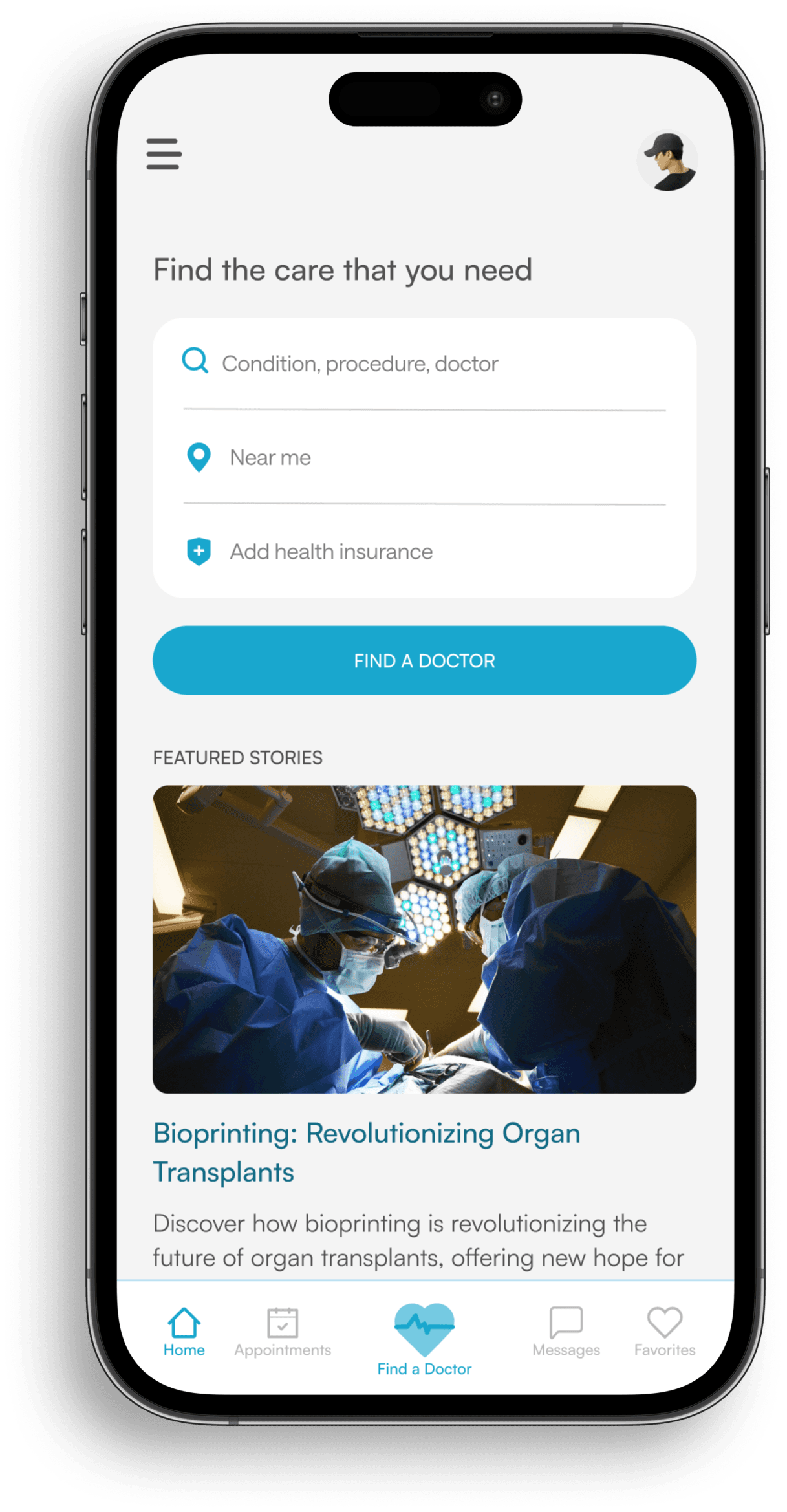
Home Screen
The home screen lets users start a search immediately, offering the fastest way to find care
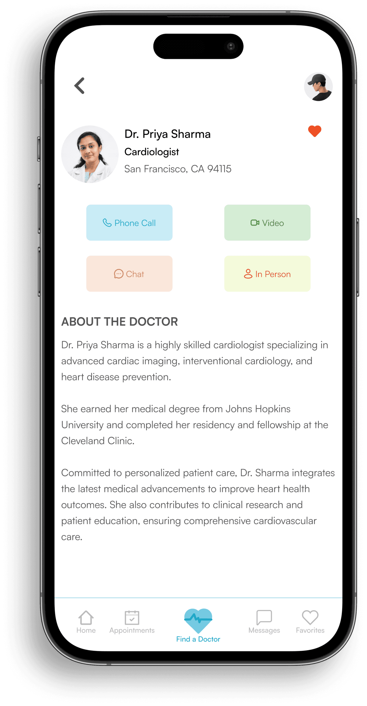
Doctor Profile
The doctor profile provides users with detailed info about healthcare providers and the different appointment options available
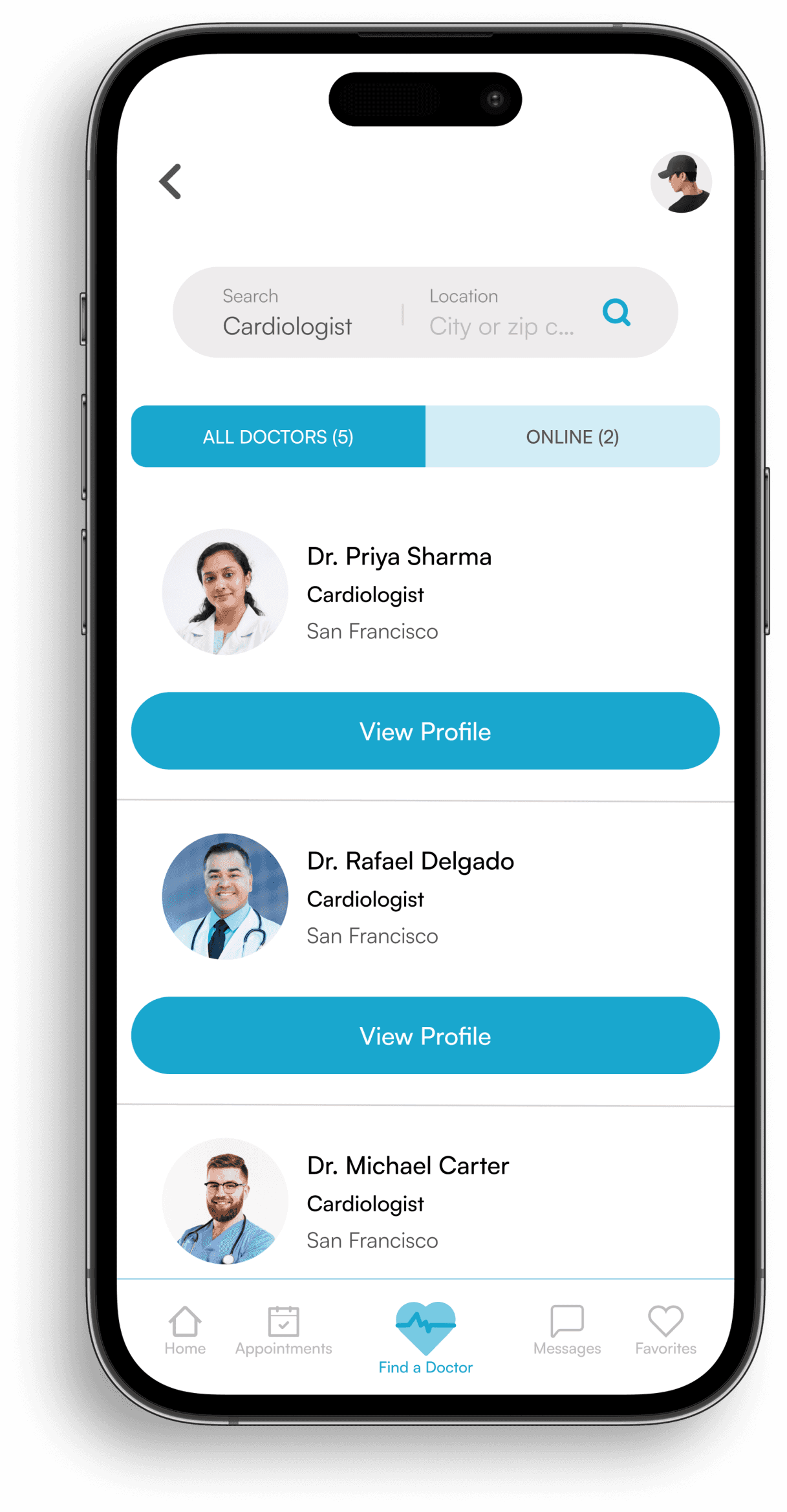
Search Screen
The search screen gives users a streamlined way to find the right healthcare providers based on their needs

Chat
Chat lets users communicate with doctors in real-time and easily switch to a video call if needed
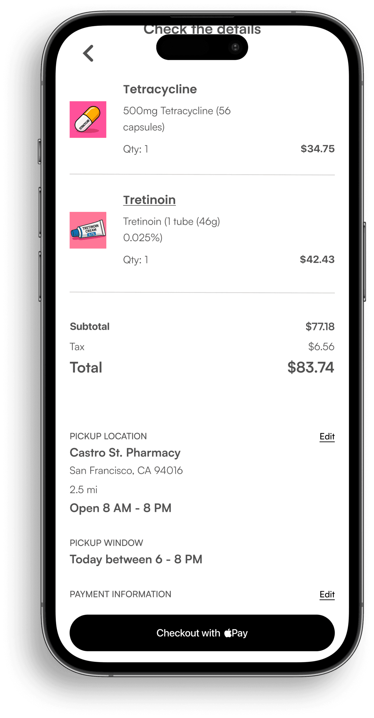
Order Verification
This screen lets users review and confirm all details before finalizing their pharmacy orders
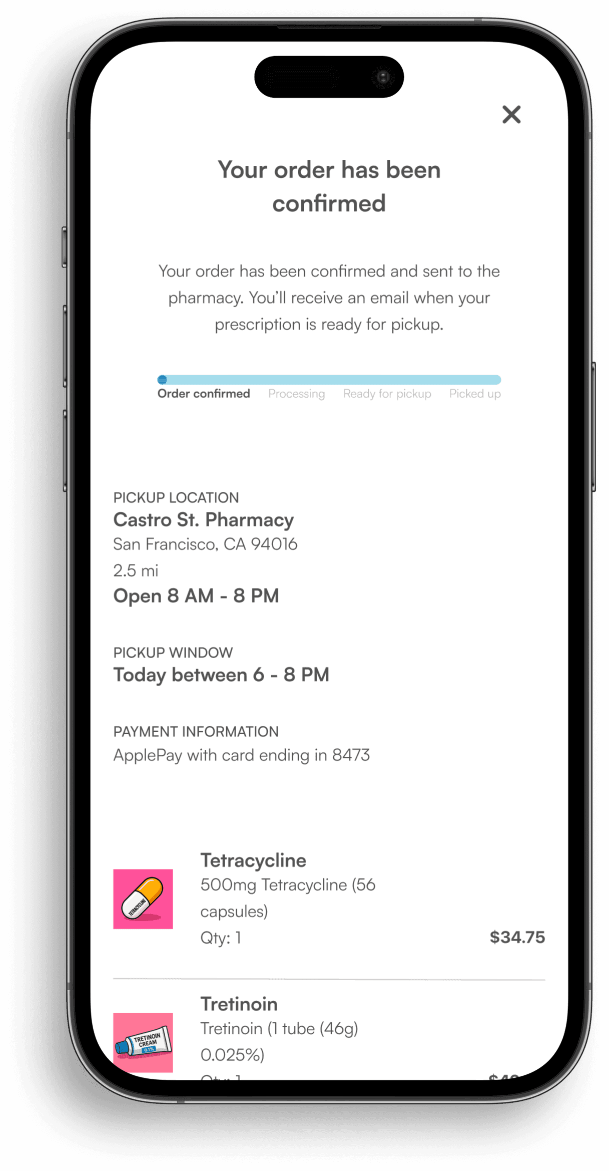
Order Confirmation
The order confirmation screen tracks and displays the status of pharmacy orders
The Results
MedConnect removes common barriers to accessing care
Streamlined booking flows and multi‑channel support make it easier and faster for patients to take action, leading to measurable improvements. The projected results below reflect the impact of this experience
21%↑
User-Focused Design
Streamlined booking flow and simplified navigation make care easier to access
1m 9s↓
Response Time
Chat and video enable a much faster provider connection
46% ↑
Apointment Conversions
Multi-channel care options and clear flows boost engagement
What I Learned
As my first design project, there were a lot of learns
A
Search Right from the Home Page
Users wanted to start looking for doctors as soon as they opened the app. Adding search to the home page made it faster to begin and cut out unnecessary taps
B
Simple Paths to the Right Care
Users could connect in four clear ways: chat, email, in person, or video. This made it easier to choose the care they needed and find the right doctor.
C
Flexible Flow to Finish Tasks
Users could start with chat and switch to video if needed, and doctors could send prescription links that led straight to choosing a pickup location. This made it easier for people to complete their visit from start to finish