
CASE STUDY — 2024
Redesigning travel searches to prioritize experiences over location. Research showed activities decided where people stayed, so occasion moved into the first search someone makes instead of sitting below the fold.
Role
Product designer (solo)
Timeline
Platform
Desktop
Scope
Self-initiated concept
TLDR;
Overview
Booking a trip usually means separate searches for a place to stay, things to do, and events nearby. Aventus combines all three into one search, built around the occasion of the trip. I worked from a research team’s findings to design the sketches, wireframes, and mockups, then ran usability testing to refine the design.
THE PROBLEM
Finding the right stay takes checking too many sources
People research a stay across several sources. Sources are scattered and inconsistent, making options hard to compare. Even after checking all of them, people still don’t feel confident they picked the right place.
5.1/10
Average score for the researching stage of the booking journey.
PROVIDED BY THE RESEARCH TEAM.
80%
Of participants said accommodation and nearby activities are decided together.
PROVIDED BY THE RESEARCH TEAM.
RESEARCH
Activities decided where people stayed
Every participant in the research said nearby events and activities influenced where they chose to book. Accommodation wasn’t the first decision, it was often the second one, made around what there was to do.
100%
Of participants said nearby events and activities influenced where they chose to book.
PROVIDED BY THE RESEARCH TEAM.
The research team’s findings centered on individual travelers, but the persona they provided was a couple. I designed for both. One person does the searching, and the occasion sits at the center, because an occasion is a shared reason to travel. Activities near the stay have to work for everyone going.
82%
Of global tourism bookings are not solo. Solo travelers account for the remaining 18%.
SPHERICAL INSIGHTS, SOLO TRAVEL MARKET REPORT. CHECKED AFTER THE PROJECT, NOT PART OF THE RESEARCH PACKET.
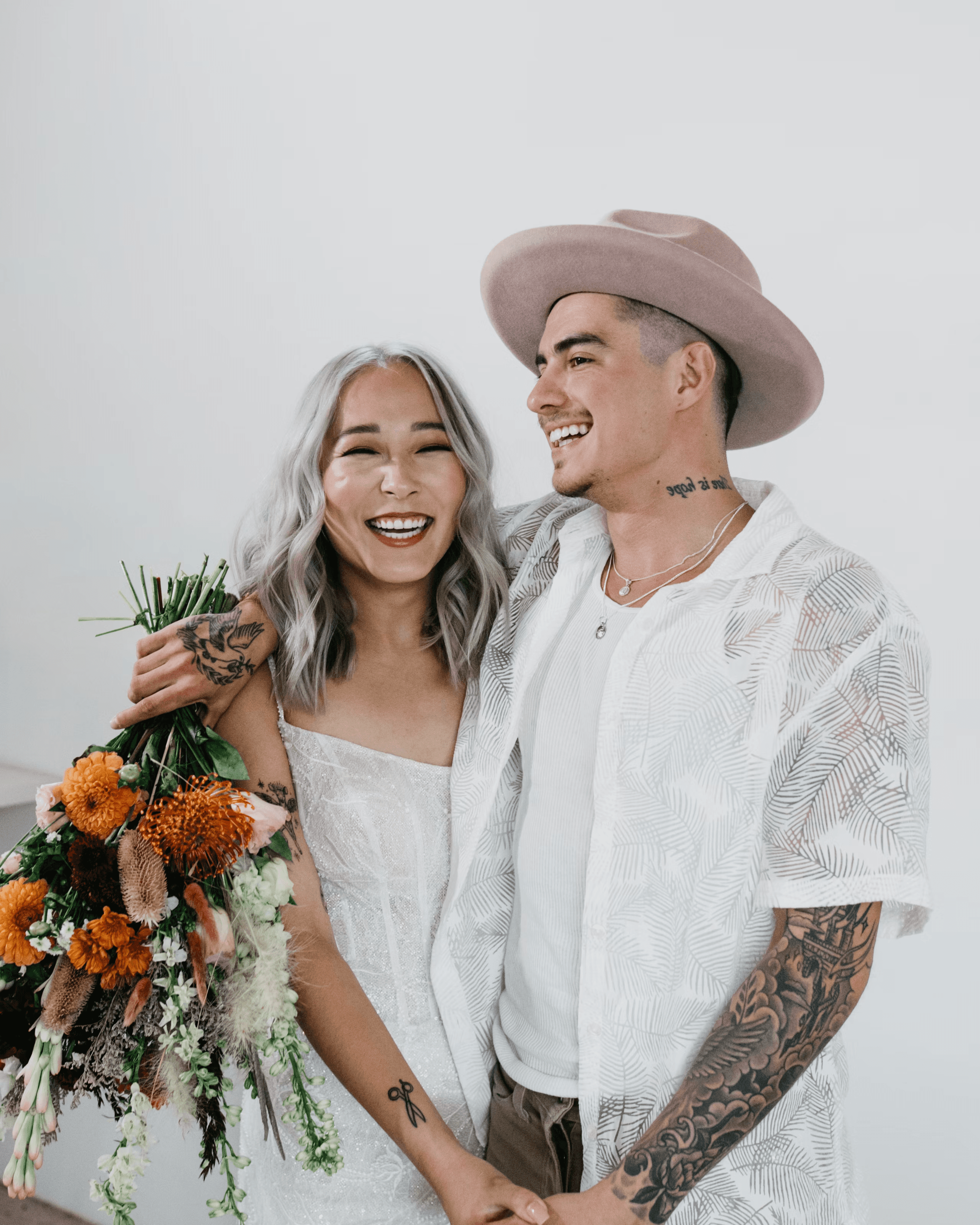
Justin and Jasmine are that case: a married couple planning around an anniversary, balancing budget against activities worth the trip.
NEWLY MARRIED
Justin & Jasmine
26 YEARS OLD
We end up checking so many different websites to find the right stay for our anniversary.
NEEDS
A vacation within budget with activities near their rented stay.
WANTS
A stay that suits the occasion, beyond a place to sleep.
WIREFRAMES
Wireframes mapped occasion search from homepage to listing
I built wireframes for the core pages: home, search, and listings, each with search by occasion built in from the start. I tested the flow with users in two states, logged-in and logged-out. Logged-in skipped account creation and went straight to reviewing the booking; both states could complete a booking.

Occasion search from the start
The main search bar includes occasion alongside location and dates, not added on separately.

Filters shown alongside results
A sidebar shows filters next to the search results based on search criteria.
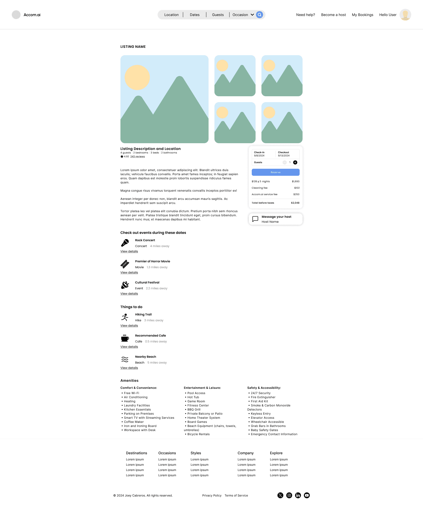
Events tied to the selected dates
Nearby events and things to do are pulled in for the exact check-in and check-out dates chosen.
DESIGN RATIONALE
Four changes from wireframe to mockup
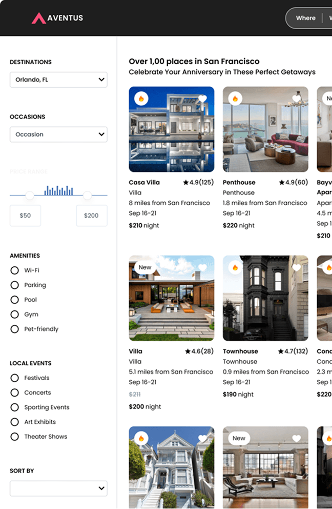
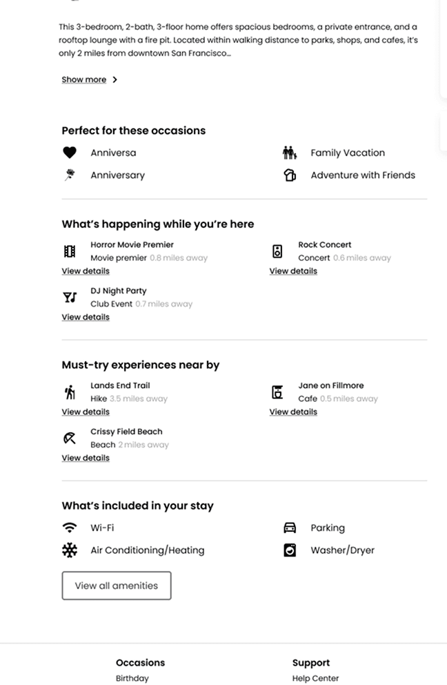
At the mockup stage, I made four changes:
01
Occasion moved out of the main search bar because it felt too crowded, and stayed as its own carousel.
02
Occasion also got its own dropdown on the search results page.
03
The filter sidebar became persistent during search, instead of collapsible.
04
Listings gained a “what’s happening” section showing nearby events for the selected dates.

ITERATION
Testing found occasion search wasn’t the main focus of the platform
Users found the design intuitive and smooth, but they said occasion search needed to be a bigger part of the experience. On an occasion-based platform, it should be the main focus. I made two changes in response:
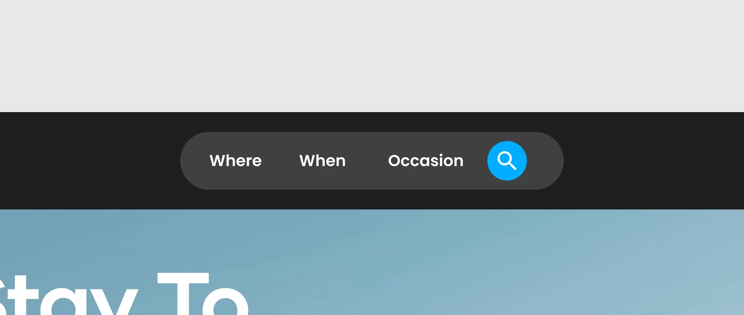
Occasions in the search
Highlighting occasion in the search bar made it a core part of the search. Keeping the bar visible across the site let users adjust it at any time.
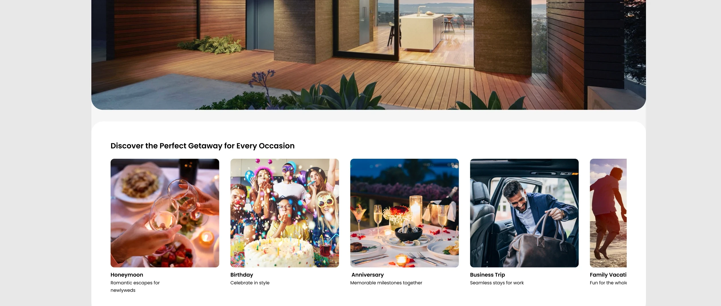
Relocating the occasions carousel
Placing the carousel directly under the hero section and enlarging the images made occasion search more visible.
The next change I would make is on the homepage. Occasions and events show up in search and on listings, so a homepage feature highlighting locations with major upcoming events would let people book around something happening nearby rather than an occasion they arrived with.
CHALLENGES & CONSTRAINTS
Designing solo meant handling validation, feedback, and prioritization without a team
There was no team to split the workload with or check ideas against. I had to validate ideas, gather feedback, and prioritize what mattered on my own.
01
IDEA VALIDATION
Without a team to provide feedback, I used research and usability testing to shape how search by occasion worked alongside location and dates.
02
INHERITED RESEARCH
I did not run the research. I worked from another team’s findings, which centered on individual travelers, and had to decide where that scope stopped matching the trips people were planning.
03
PRIORITIZATION
I balanced analyzing research, prioritizing occasions as the main feature, and prototyping to help users discover and select stays easily.
OUTCOMES
How I would know whether occasion search worked
This design was never built, so there is no live data. These are the numbers I would watch, and what each one would tell me.
MEASURE
Share of searches that include an occasion
WHAT IT WOULD TELL ME
If occasion stays under 10% of searches, putting it in the search bar was the wrong call and it belongs somewhere people discover it instead.
MEASURE
Clicks on the occasions carousel
WHAT IT WOULD TELL ME
Moving it under the hero and enlarging the images should raise clicks. Flat numbers would mean the placement was never the problem.
MEASURE
Sources checked before booking
WHAT IT WOULD TELL ME
The research scored the researching stage 5.1 out of 10. If people still open other sites to find activities, one search did not replace the scattered ones.
REFLECTION
What I’d do differently now
Let data lead over visual instinct
I removed occasion from the search bar because it felt crowded next to location and dates. That was a visual call, made without the research that was already available. Testing showed occasion needed to stay in the search bar from the start. Testing an assumption is still a valid way to learn, but when data like this already exists, it should lead the decision first.
Question the scope of research I inherit
I took the research team’s findings at face value and started designing. The gap between findings centered on individual travelers and a persona who was a couple only became clear to me partway through. Reading the scope of a study first, and asking who it left out, would have shaped the occasion decision from the start instead of after.
